Marketing, Magic, & The Messy Middle: Wickedly Branded
Welcome to the Wickedly Branded: Marketing, Magic, & The Messy Middle Podcast with Beverly Cornell
💡 Welcome to our business, branding, and marketing podcast, where real conversations meet effective strategies. Join me, Beverly Cornell, founder of Wickedly Branded and author of Marketing for Entrepreneurs, as we explore practical ways to clarify your brand and market confidently.
With over 25 years of experience and features in MSN, FOX, CBS, and Bloomberg, I specialize in helping overwhelmed consultants, coaches, and creatives streamline their marketing efforts. Together, we'll identify where to focus your branding energy and eliminate wasted time on ineffective tactics. Let’s get started on your journey to clarity and connection!
What to Expect Each Week
Every Tuesday, we have insightful, fun, and honest conversations about marketing, branding, and business growth.
🌟 The Sparks: Business and Brand Breakthroughs
We jump into the pivotal moments that shaped our guests’ businesses, the bold moves, the unexpected wins, and the shifts that made the biggest impact.
🔥 Branding, Visibility, and Marketing That Feels Right
Marketing should feel natural, exciting, and true to you, not awkward or forced. We explore practical strategies for branding and visibility so you can connect with the right people in a way that fits who you are.
🎩 The Magic Hat: Fun and Unexpected Questions
Our magical purple sequined hat holds rapid-fire questions designed to keep things fun and spontaneous. Business should have a little magic too.
✨ The Magic Wand: Looking Back and Looking Ahead
With a wave of our wand, we take guests back to their younger selves and forward to their future legacy. What we build today shapes what we leave behind.
Who This is For
If you're feeling overwhelmed and overworked by the marketing grind, you're in the right place. You started your business with passion, but now seek more alignment, clarity, and traction. Perhaps you've DIY’d your brand and experimented with various strategies to find what truly works.
Here’s what we believe:
✨ Your brand magic is already in you.
You don’t need to hustle harder, you need clarity, confidence, and a strategy that fits you. Whether you're a coach, consultant, or creative entrepreneur who wants to stand out, attract the right clients, and market in a way that feels good, this podcast was made for you.
Why Tune In?
💡 At Wickedly Branded, we believe marketing is about more than visibility. It is about making a meaningful impact, connecting with the right people, and building a brand that truly reflects who you are.
New episodes drop every Tuesday. Subscribe now for real conversations, inspiration, and practical strategies to market your business in a way that feels right for you.
If you want to be a guest, visit here: https://wickedlybranded.com/marketing-resources/small-business-marketing-podcast/ to sign up for our application, or send Beverly Cornell a message on PodMatch, here: https://www.podmatch.com/hostdetailpreview/1742872522686428855f67e40
Visit https://wickedlybranded.com/ for all your branding and digital marketing needs.
Your support matters and helps ensure we continue to produce this podcast. https://www.buzzsprout.com/2295030/support.
Marketing, Magic, & The Messy Middle: Wickedly Branded
The Secret to More Leads: Powerful CTAs | Beverly Cornell
Welcome to Spark & Ignite Your Marketing, the podcast where real conversations meet real strategies. I'm your host, Beverly Cornell, founder and fairy godmother of brand clarity at Wickedly Branded. With over 25 years of experience, I’ve helped hundreds of entrepreneurs awaken their brand magic, attract the right people, and build businesses that light them up.
Is your website turning visitors into customers? If not, you might be missing the magic of a powerful Call to Action (CTA). In this episode, I reveal how optimizing your website’s CTAs can increase leads and conversions. Using real-life success stories from clients like Tom's landscaping business, I break down actionable tips on crafting CTAs that guide visitors effortlessly toward taking action.
Whether you're aiming to improve your website’s user experience or drive more business, this episode is a must-listen. Tune in and learn how a simple tweak could skyrocket your success!
Tune in now to discover:
- The essential elements of a high-converting CTA
- How to strategically place CTAs for maximum impact
- Real-world examples of CTA success stories
Learn more about mastering your Brand Authority here!
Dare to be Wickedly Branded
P.S. Take the first step (will only take you 3 minutes) to awaken your brand magic with our personalized Brand Clarity Quiz
Hello, everyone. Welcome to another episode of the Sparkening Night, Your Marketing Podcast. I'm your host, Beverly Cornell, founder and growth strategist at BC and Associates Marketing. Today, we're going to focus on one simple, but extremely powerful tip that can transform your service based businesses website, whether you're looking to attract more visitors, convert more leads, or simply improve user experience, this one tip. It's for you. Grab your coffee or tea and sit back and let's dive in. Let me start with a little story. I recently worked with a client named Tom who owned a small but growing landscaping business. Tom had a beautiful website with stunning photos of his work, but he wasn't getting any of the leads he'd hoped for. He asked me, Beverly, what is one thing that I can do to really make a difference on my website? And that's what brings us to today's episode. The answer lies in optimizing your website's call to action, what we call in the industry, your CTA, call to action. So what exactly is a call to action? A call to action is a prompt on your website that tells visitors what action You want them to take next. It could be anything from contact us to get a quote, sign up for our newsletter, or book a consultation. Think of your CTA as the gateway to converting a visitor. into a customer. It's the bridge between someone browsing your website and someone reaching out to do business with you. Without a clear and compelling CTA, your visitors will leave your site without taking action. So let's talk about what an effective CTA is. And here's a few tips to keep in mind. You always want your CTA to be straight forward. and easy to understand. It's like leading them on a journey. We're their guide and we're trying to let them know what they need to do next. The next clear and specific step you want them to do. So try to avoid phrases like click here. Instead, be super specific about what action you want your visitors to take. Things that are better are like schedule a free consultation, download our free pricing guide, Use action oriented language. Start your CTA with a strong verb that encourages action. Words like get, start, try, join, or discover can create a sense of urgency and excitement. Adding a sense of urgency can motivate visitors to take action right away. Phrases like limited time offer, Book now, join today, can be very effective at doing this. You want to stand out. Your CTA should be visually distinct from the rest of your content. Use contrasting colors, larger fonts or buttons to make it pop. It should catch the visitor's eye and be super easy to find. Somebody once said, does it pass the grunt test? Could a caveman Figure out what they're supposed to do next. Strategically. Place your CTA in areas where visitors are most likely to see it, such as the top right of your page, at the end of every single blog post or on a dedicated landing page. Do not ever make your visitors hunt for your CTA. You want it to be super easy. Revealing the next step on how to do business with you. So let's go back to Tom's landscaping business. He had a beautiful portfolio on his homepage, but his contact us button was buried all the way at the bottom of the page. We moved the CTA to a more prominent location and use the phrase, get your free quote today and made it stand out with a bright color. The result, a significant increase in queries and new clients for Tom. You want to make sure that you're testing and iterating. One very, very crucial aspect of optimizing your CTA is doing this. You want to have A B testing. This allows you to compare different versions of your CTA to see which one is performing better. Maybe it's by location. Maybe it's the highlight color. Maybe it's the font. All different things that you can test A, B to see which ones your clients prefer. Tools like Google Optimize or HotShark can help you run these tests and gather valuable data. Remember, what works for one business might not work for another. So testing and iterating are key to finding the most effective CTAs for your website. A strong CTA not only improves conversions, but also enhances the overall user experience for your clients. When visitors come to your website, they should have a very clear path to follow. A well placed CTA should guide them through their entire journey and make it easy for them to take the next step with you. This creates a seamless experience that builds trust and makes your website way more user friendly. I've seen the impact of a powerful CTA firsthand. Another one of our clients, a small accounting firm, had a generic contact us link on their website. We changed it to schedule your free financial consultation today and positioned it more prominently on their homepage and on their service pages. Not only did their consultation bookings increase, but they also received more positive feedback from their clients about how easy it was to use their website. These real life success stories show that a well crafted CTA can make a significant difference. So to wrap up, if there's one big tip that I could give you to improve your service based business's website, it's to optimize your call to action. A clear, compelling, and strategically placed CTA can guide your visitors and your clients to take action, ultimately leading to more leads, and more conversions and more business. Thank you for joining us today on the sparking that you're marketing podcast. I hope you found this tip to be helpful and are ready to enhance your website's CTA. If you have any questions or you need further assistance, don't hesitate to reach out. We're happy to hop on a chat with you for 15 minutes. Absolutely free. You can ask all kinds of questions. You can share your goals and you can see if we are a good fit for you until then. Stay tuned for more inspiring conversations and actionable tips that you can use on your marketing. Until next time, keep sparking and igniting.
Podcasts we love
Check out these other fine podcasts recommended by us, not an algorithm.

The Mel Robbins Podcast
Mel Robbins
The Amy Porterfield Show
Amy Porterfield
Online Marketing Made Easy
Amy Porterfield
Social Media Marketing Talk Show
Michael Stelzner, Social Media Examiner
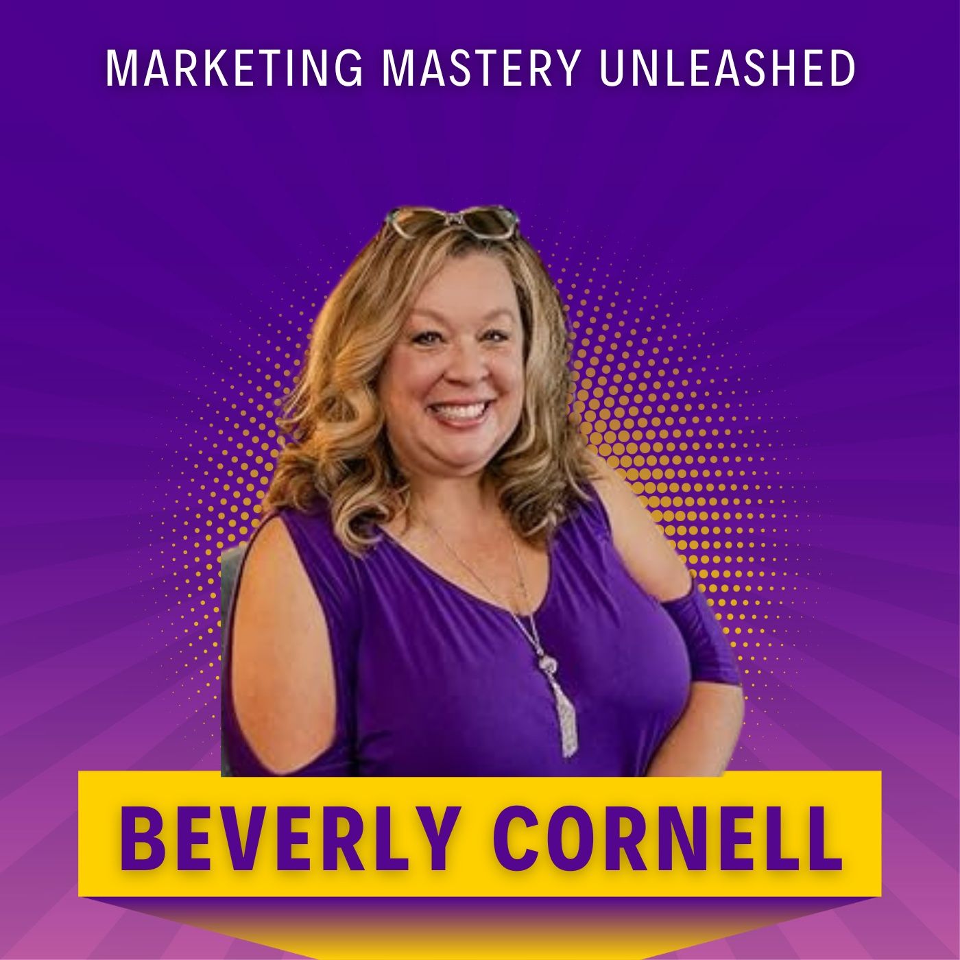
Marketing Mastery: Attract, Convert & Grow
Beverly Cornell
